Freshly Picked: Watson's Farm Rebrand
Watson's Farm is a beloved Pick-Your-Own destination in Bowmanville, Ontario, but its branding and on-site experience no longer reflected the energy of the farm today. This mock academic project reimagines Watson's though a refreshed visual identity, wayfinding system, and product design, creating a clearer, more joyful experience for families at every step of their visit.

The Challenge
Despite it's popularity, Watson's Farm's existing branding and navigation no longer reflected the quality or scale of the experience it offers. Visual inconsistency, outdated branding, and unclear wayfinding made it difficult for families to fully enjoy the Pick-Your-Own experience. The challenge was to modernize the brand and improve usability without losing the warmth, authenticity, and community-focused values that define the farm.
Key Goals
• Rebrand Watson's Farm with a fresh, modern, and family-friendly identity.
• Improve navigation through a clear and intuitive wayfinding system
• Create a cohesive design system across packaging, signage, and promotional materials.

01
Getting to Know the Farm
Digging Into the Brand and its People
I started by learning Watson's farm inside and out. Its history, what it offers, and who it serves. Understanding the farm's family-first values helped me see what absolutely needed to stay, and what could be refreshed.
Seeing Where Watson's Fits Into the Lanscape
I looked at other Pick-Your-Own farms and nearby farmers' markets to understand what already exists and where things felt repetitive. This made it clear how Watson's Farm could stand out while still feeling familiar and welcoming.
Experiencing the Farm Firsthand
Visiting the farm myself was key. Walking through the spaces as a visitor made it obvious where navigation breaks down, especially for families trying to move between activities, and confirmed the need for clearer wayfinding.
02
Setting the Vibe
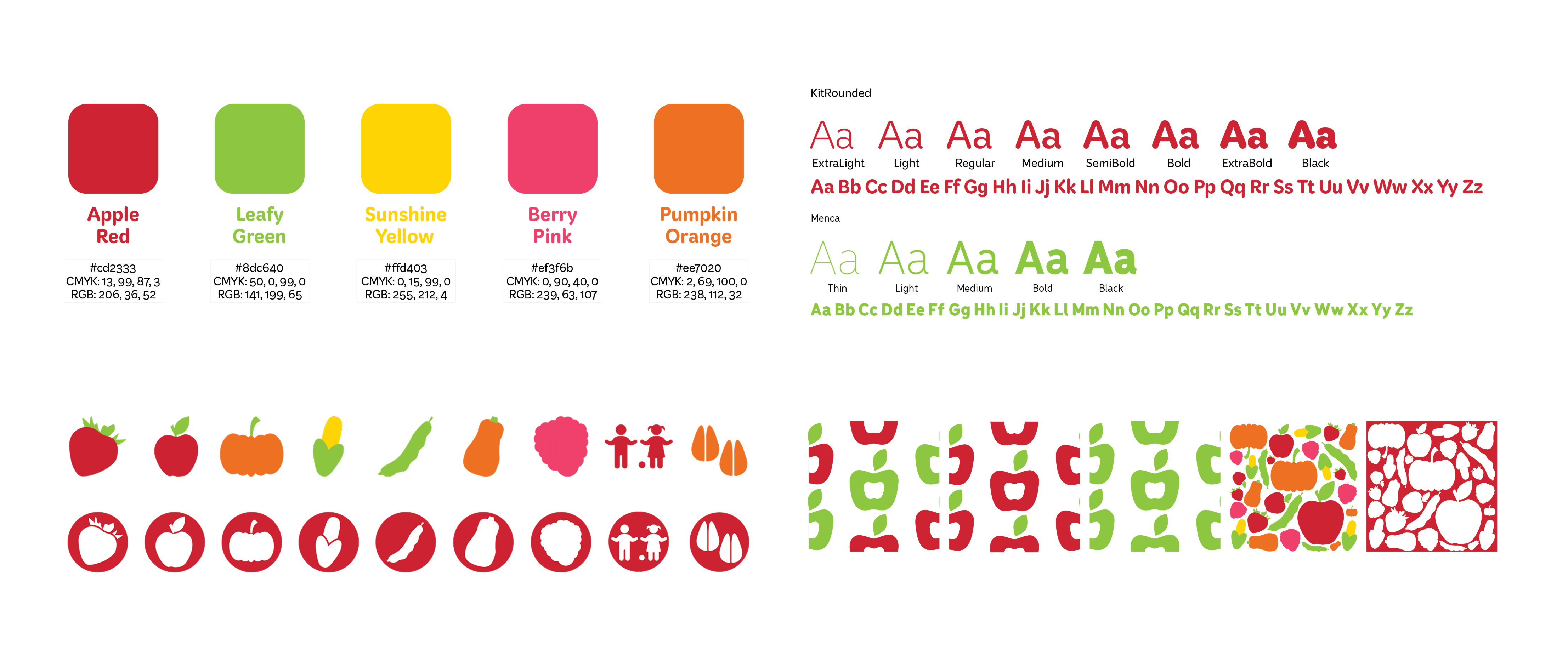
Finding the Right Visual Direction
From the start, I wanted the brand to feel fun, fresh, and easy to spot, without losing the warmth that makes Watson's Farm special. The goal wasn't to reinvent the farm, but help it feel more like itself today.
Stepping Away From the Expected
I intentionally avoided the overly rustic look that many farm brands lean into. Instead, I explored clean type, playful shapes, and bright, natural colours to give the brand a more modern and energetic feel.
Establishing Tone and Energy Early on
The mood board helped lock in the personality of the brand early. It became a reference point that kept everything feeling friendly, joyful, and easy to navigate as the project evolved.
03
The Heart of the Brand
From Idea to Identity
The logo was designed as a typographic mark, with an apple replacing the "o" in Watson's. A small detail that directly ties the brand to the Pick-Your-Own experience. It's simple, recognizable, and feels natural to the farm.
Built to Work Everywhere
I created several logo variations so it could adapt easily across signage, packaging, and promotional materials. This flexibility helped keep the brand consistent without feeling repetitive.
A Clear Step Forward
Compared to the original logo, the new mark is much cleaner and easier to read. The direction felt clear early on, inspired by the farm itself rather than forcing a trend-driven solution.
04
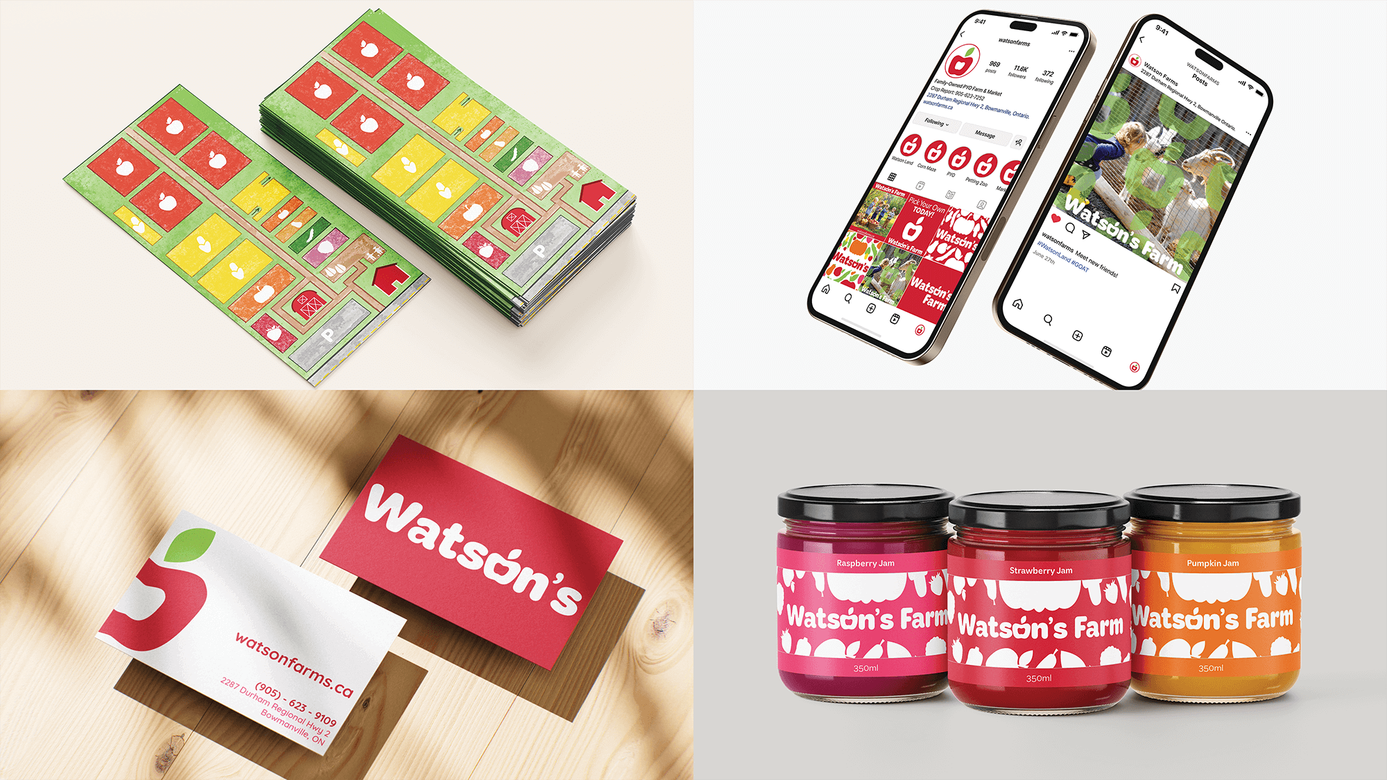
Bringing the Brand to Life
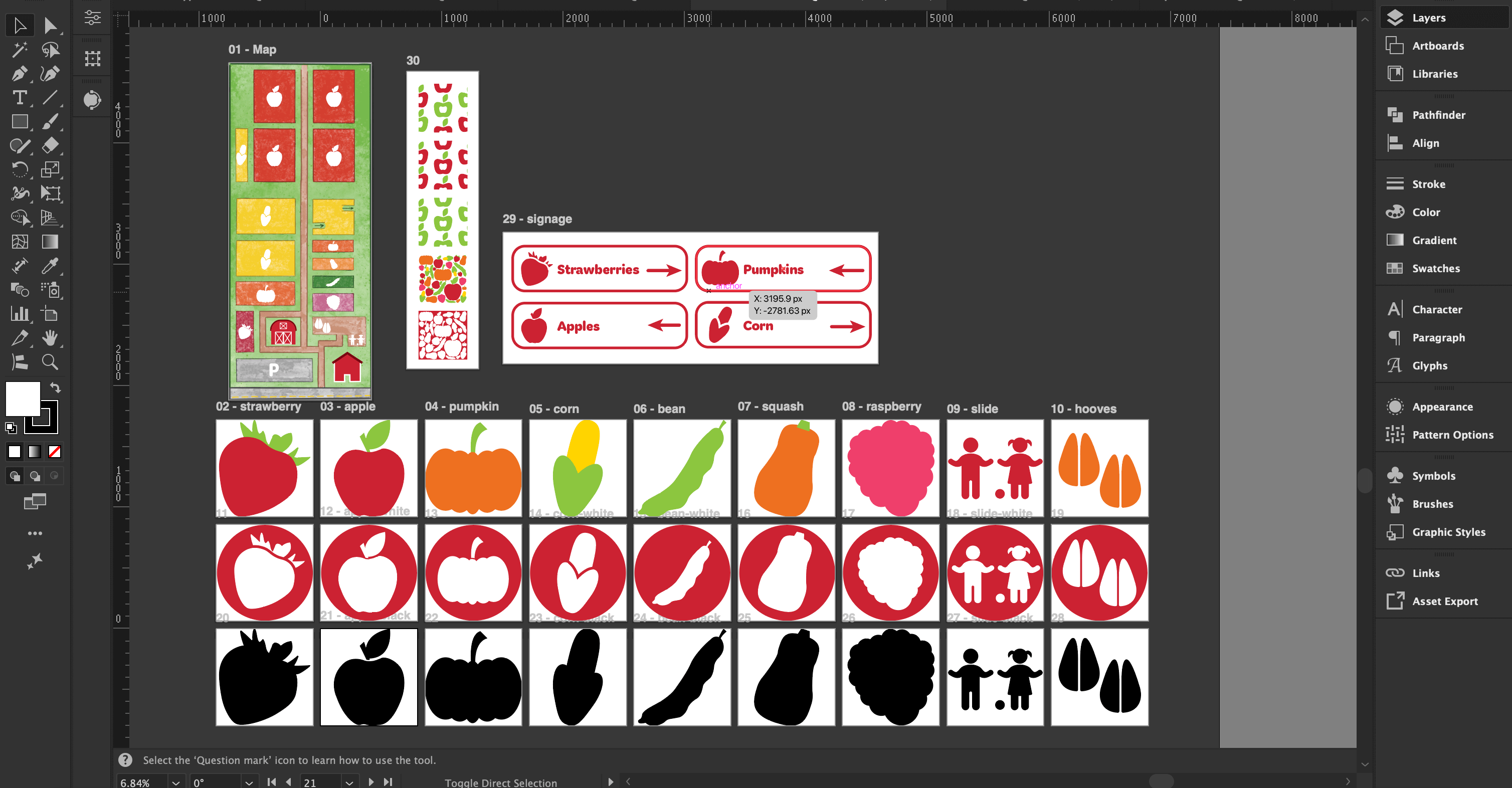
Making the Farm Easier to Navigate
Wayfinding was a major focus of this project. I designed signage, icons, and maps that help visitors feel confident moving through the farm, especially during busy Pick-Your-Own seasons.
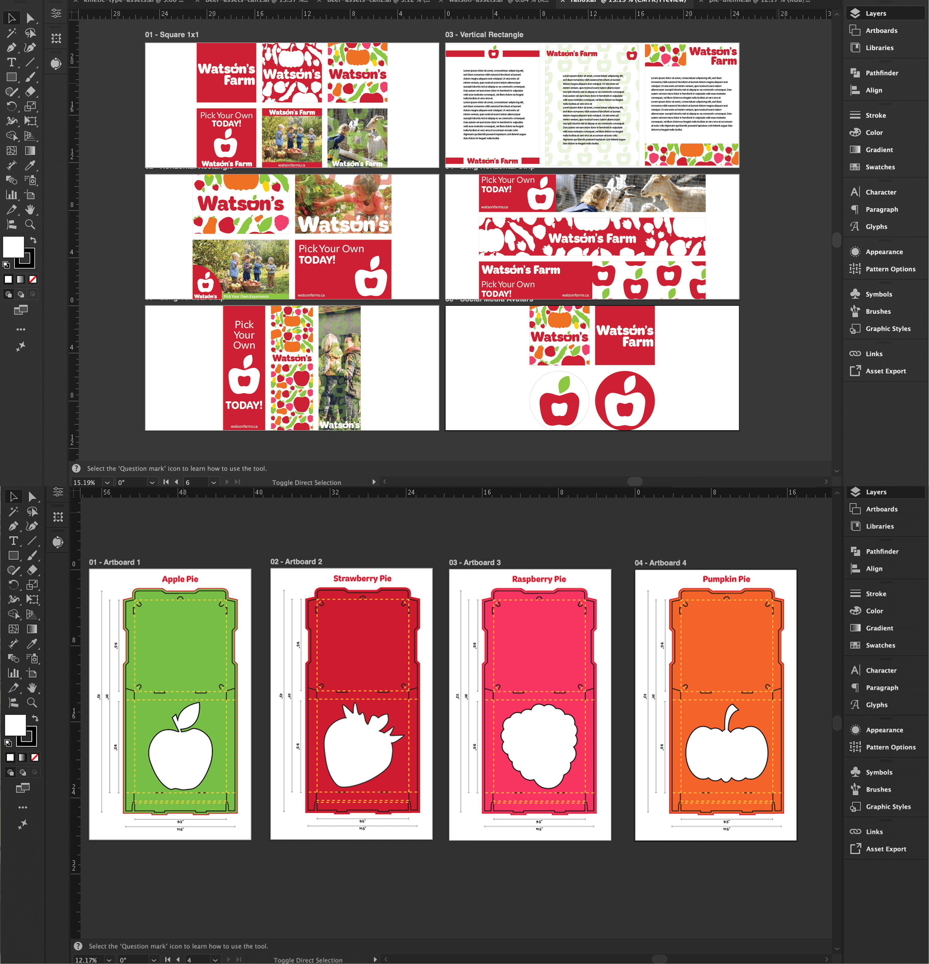
Designing for Real Moments
Packaging for pies, jams, tickets, and other products was designed to feel cohesive and easy to understand. Each piece was created to work as part of a larger system rather than as a one-off design.
Extending the Experience Beyond the Farm
Promotional materials, social media assets, and merchandise helped carry the brand beyond the physical space. This ensured visitors would recognize Watson's Farm wherever they encountered it.
05
Refining the Details
Design Shaped by Critique
Throughout the project, I received ongoing feedback during critiques, which helped guide refinements. These adjustments focused on improving clarity and cohesion rather than changing the overall direction.
Polished the Wayfinding System
The wayfinding elements went through several rounds of small tweaks, especially in the icons and signage layouts. Even subtle changes made a noticeable difference in readability and flow.
Strengthening the System as a Whole
This phase was about making sure everything worked together seamlessly. Each refinement helped reinforce the brand as one cohesive system instead of a collection of separate pieces.
06
Making it Real (Almost)
Seeing the Brand in Action
Mockups were created for every asset to show how to brand would live in the real world. This made it easier to evaluate how the system worked across different contexts.
Showing Consistency at Every Touchpoint
Applying the brand to signage, packaging, merchandise, and promotional materials highlighted how strong the system becomes when everything works together.
The Details That Stand Out
Smaller branded items, like stickers, became standout moments in the mockups. These details helped showcase the playful, friendly personality of the brand and brought everything to life.
Picked to Bring Watson's Farm Back to Life
This project was an absolute joy to work on from start to finish. Building the brand system, assets, and mockups felt natural and exciting, allowing the identity to grow organically as I went. The result is cohesive, playful, and authentic to Watson's Farm. Overall, I'm incredibly proud of the final outcome.
Curious about what we could make together? Don't be shy, let's chat!