Culinary Newsletter Design
This project was a culinary themed newsletter created for my typography class. The goal was to experiment with typographic hierarchy, grids, and visual balance while presenting food content in a way that was clean, enticing, and tailored to the target audience.
The Challenge
The assignment challenged me to design a newsletter that not only demonstrated strong typographic hierarchy and grid-based structure, but also captured the essence of food. The design had to feel appetizing, professional, and visually engaging for the target audience, while organizing large amounts of text in a clear, appealing way.
Key Goals
• Establish clear and typohraphics hierarchy.
• Balance large amounts of text with imagery.
• Make food look inviting and appetizing through thoughtful design choices.

01
Roughs
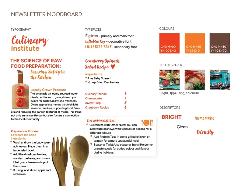
Mood Board First
Before jumping into layouts, I built a quick mood board to get a sense of tone. I found colours that work well with food, type inspiration, and overal vibe.
Starting in InDesign
I moved straight into InDesign and began loosely placing text and images just ot understand the structure. Nothing polished, just exploring.
Playing with the 3-Columnn Grid
I tested how content flowed across different grids, shifting elements to see what felt balanced. I decided on the 3-column grid in the end.
02
Refining
Tightening the Layout
Once I found a direction, I cleaned things up. Using the grid more intentionally, organizing spaces, and building clearer hierarchy.
Type Adjustments
I explored type combinations until I found what is most readable, structurded, but still a load of fun.
Bringing in the Colour!
I experimented with colours that complemented the food photography. I made sure to avoid blue, the fastest way to make food look weird.
03
Finalizing
I Locked in the Design
I finalized the structure, typography, imagery, and overall style. Once everything was functioning visually, I commited to the final direction.
Print Testing (A Lot of It)
I went through multiple test prints to check colour accuracy, spacing, and how the images changes when off-screen. Seeing it physically helped me catch things you only notice on paper.
Fine-Tuning Details
After reviewing the printouts, I made all the final micro-adjustments, spacing tweaks, alignments fixes, and more. Until the layout felt intentional, polished, and fully ready to go.
04
Implementing
Final Export
Once I found a direction, I cleaned things up. Using the grid more intentionally, organizing spaces, and building clearer hierarchy.
Presentation Prep
I organized everything so it was easy to showcase. Polished pages, clean files, and an amazing final design.
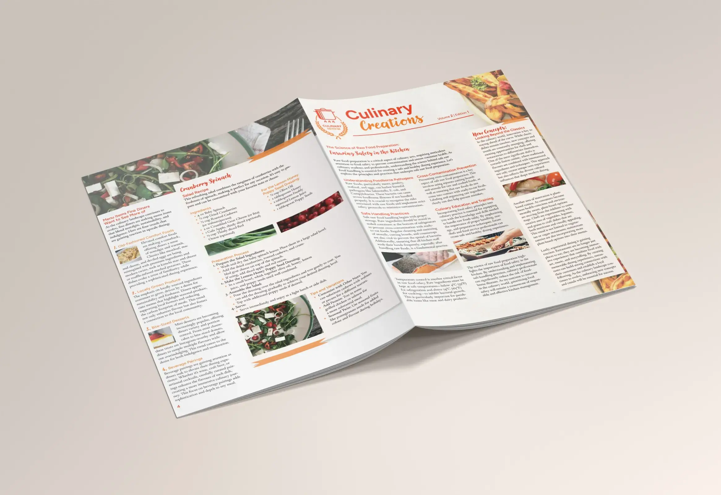
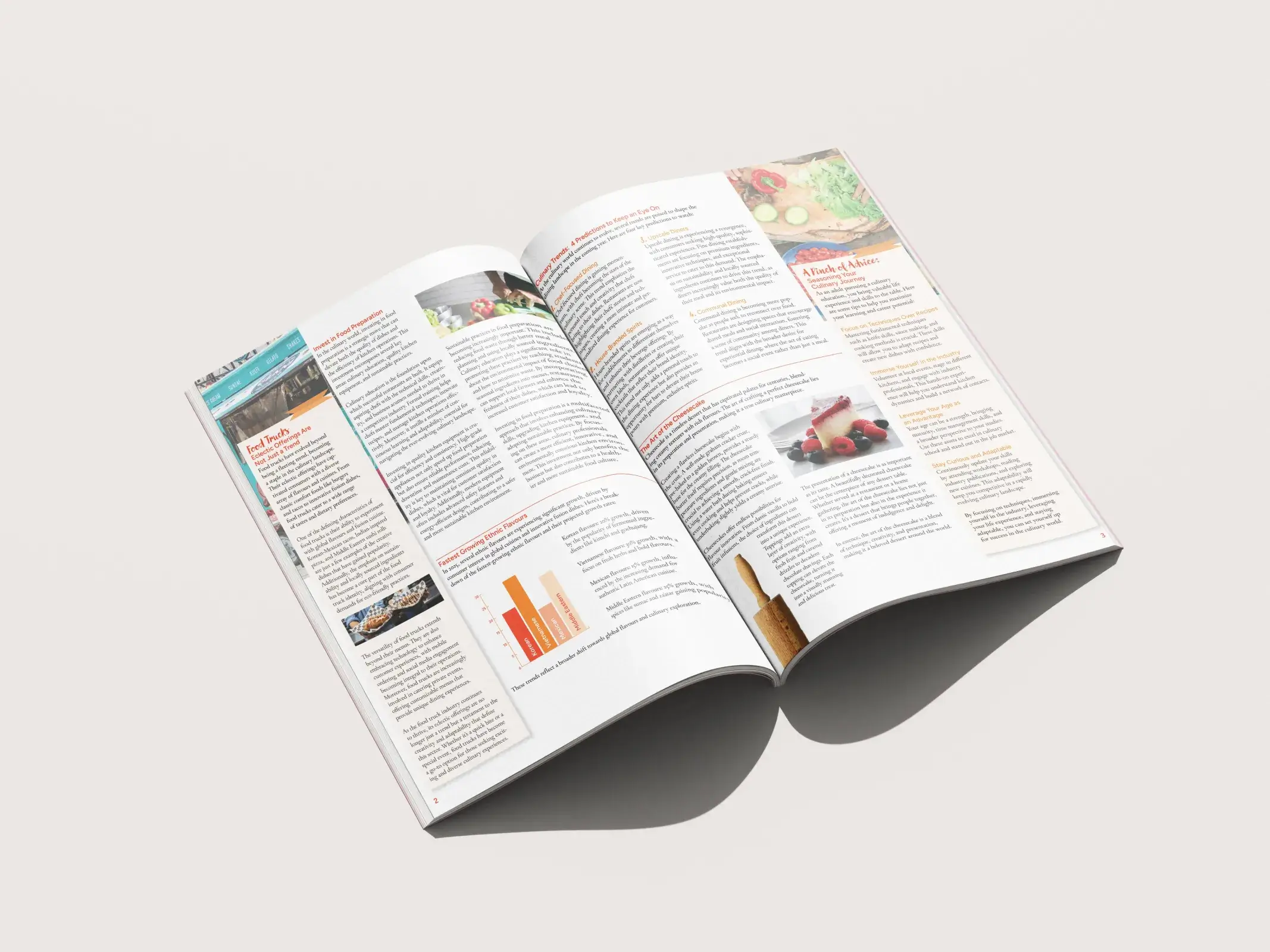
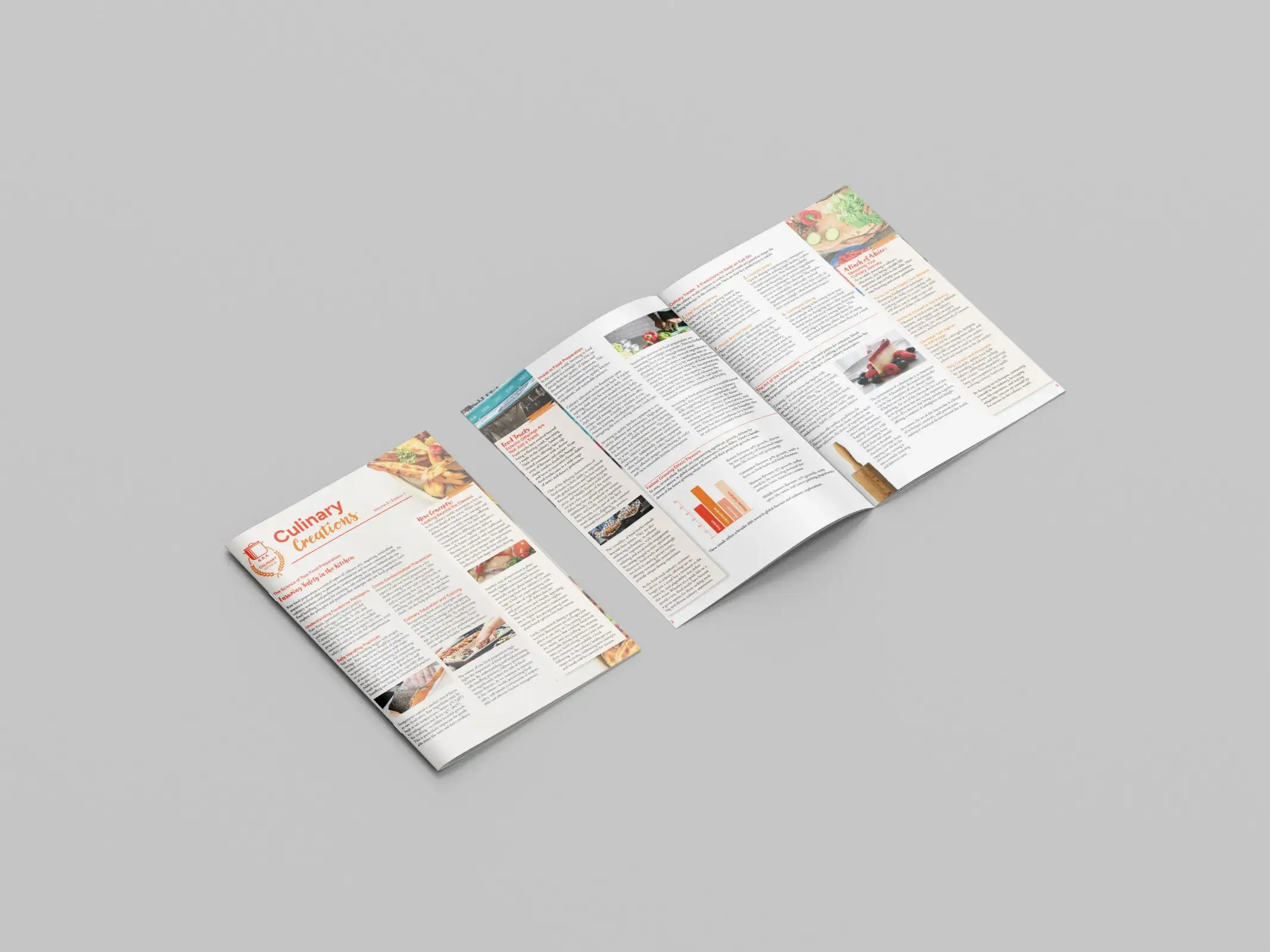
Mockups
I created mockups to see the newsletter in context, which really helped confirm the final design.
Designed to be Delicious
This project strengthened my skills in typographic hierarchy, grid systems, and editiorial layout. I learned how to fit large amounts of text into a design while keeping it appealing and readable. A key takeaway was the importance of colour in food design.
Curious about what we could make together? Don't be shy, let's chat!