TMS Life: Breathing New Life Into a Brand
This project was a full rebrand of TMS Life, completed for my Graphic Design class. The goal was to take an outdated, overly complex identity and transform it into a clean, approachable, and professional brand that better represented the business and its services.
The Challenge
The original TMS Life branding failed to capture the essence of the brand. It was outdated, busy and inconsistent. It relied on gradients, flashy and busy details, and it had technical mistakes like poor scalability.
Key Goals
• Create a modern, professional identity.
• Simplify the visual style while still representing the brand’s mission.
• Develop a cohesive branding system that feels approachable and aligned with their audience.

01
Research
Getting to Know
I started by digging into what TMS actually is and how it’s presented. Most brands in this industry feel super clinical and cold, which immediately told me I wanted to go in the opposite direction.
I did an endless amount of research on the TMS Life community and previous brand. Googling patient comments and reading the TMS Life’s About Me page on their website to get a sense of the business’ personality.
Interview
I was lucky enough to interview the clinic’s manager and speak with her about what direction the business would like to head in. Together we built a brief for the rebrand and future branding guide.
02
Conceptualize
Mind Mapping
I dumped a bunch of words and associations onto paper. Stuff like positive, welcoming, calm, and caring. It helped me shape what the brand should feel like and helped lead me in the right direction.
Collecting Inspiration
I pulled references, colours, and brand styles that felt more alive. Things that were calming but not dull, that were modern but still approachable, and put together a mood board that would lead the rest of the design.
Defining Goals
The initial goals were already set but I further set in stone each deliverable and the intention with each. I knew the first step was to build logo, then further solidify the brand, then develop said brand. All while maintaining a professional, soft, and alive feel that would make people feel safe.
03
Sketch
Getting Messy
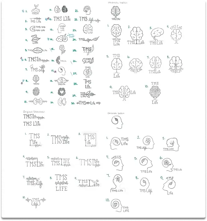
The first round of sketches consisted of me filling pages with quick logo sketches. Shapes, flows, and forms that felt like they represented the brand’s wanted perception. No overthinking, just seeing what came out.
Playing With Ideas
Some sketches leaned too literal, others too abstract, but there were a few that carried the calm, connected vibe I was chasing. I narrowed it down to 3 main concepts, which I further refined, sketching even more.
Choosing Concept
After multiple rounds of feedback from peers and other people, I selected the logo concept that felt most fitting for TMS Life. Deciding on the concept that will be again further refined except now I was stepping into the digital realm.
04
Refine, Refine, Refine
Going Digital
I took my favourite sketch and took it into Illustrator. That’s where I spent majority of my time, refining line weights, curves, and nitpicking the logo to the max. Coming up with even more variations that could potentially be the final version.
Exploring Type
I tested a bunch of fonts, trying to find the best one to match the tone. It was important that it not be too corporate, that it remained modern and friendly, while most importantly being readable and scaleable.
Testing Colours
I must have come up with over a hundred coloured variations. So many that I had to narrow it down to my 6 favourite colours, and the best version with those colours.
05
Finalize
Choosing the Final Logo
After consulting my peers and others, I decided on the final logo version that I would carry through to the rebrand of TMS Life.
Pixel Pushing
I pixel-pushed for hours making sure every detail was intentional and relevant to the new brand. Once I was finally happy with the final logo, I created the black and white, and reversed variations to ensure that the logo could be used on any medium.
Building the Brand
Using the logo as my first building block, I brought the brand to life. I gather the key ingredients to build any future components for the branding guide, being the colours, fonts and overall style.
06
Implement
Applying the Brand
Using the logo, colours, and fonts, I built brand components such as a business card, an envelope, and a letterhead. This really started bringing the brand to life, building the brand’s personality even further.
Building the Guide
With the vibe and style decided, and the business’ components made, I was able to finally start building their branding guide. Giving the business a set of guidelines that would help them utilize their brand in the best way possible. It encompassed the entire rebrand, giving the overall feel in a visual and clear way.
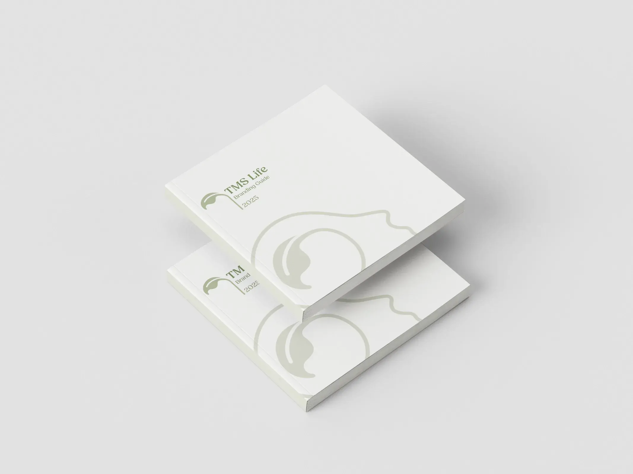
Mockups, Mockups, Mockups!
Once the branding guide was finalized, I created a set of mockups to bring everything together. Seeing the logo, colours, typography, and components in real-life contexts helped tie the whole system together. It also made the brand’s identity stronger, showing all of the possibilities.
In the end, I brought a little more life back into TMS Life
This rebrand was all about bringing TMS Life back to something simple, human, and alive. The final identity feels calm and supportive, and more importantly, less intimidating. More like a hand on your shoulder saying, you've got this. It left behind the clutter and chaos of the old brand and grew into something modern, clear, and trustworthy. Through it all, I learned how much research and intention shape a brand that actually feels right. It taught me to design with purpose, not just aesthetics, and to trust that clarity and warmth can live side by side. It reminded me of why I love branding in the first place, that mix of curiosity, structure, and a little bit of chaos that somehow lands in balance.

Curious about what we could make together? Don't be shy, let's chat!